
Crayola Toothbruth Package Redesign
A playful and colorful front design created to appeal to children while remaining clear, friendly, and instantly recognizable as a Crayola product. The back layout prioritizes readability and organization, presenting product details in a clean and approachable way without overwhelming the viewer.

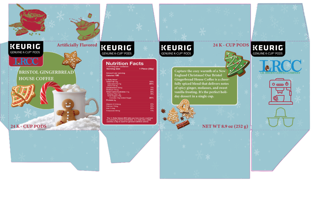
Keurig Package Redesign
This redesign explores a more modern and streamlined approach to Keurig packaging. The focus was on improving visual hierarchy, clarity, and shelf presence while maintaining brand recognition. Clean layout choices and balanced spacing help make the product information easy to read and visually engaging.

Velour Confections Package Design
This luxury-inspired confectionery package focuses on elegance and visual richness. Soft color palettes, ornamental detailing, and refined typography were used to create a premium feel and elevate the overall product experience. The design is intended to feel indulgent, gift-worthy, and visually sophisticated.
These projects highlight my approach to packaging design as both a creative and strategic process. From concept to final mockup, I focused on visual storytelling, brand consistency, and user experience. Each design challenged me to think differently while strengthening my skills in layout, hierarchy, and packaging structure.